
Working With Layouts
 Editorial photography, by it’s very nature, involves shooting pictures to work alongside words and working with the layout. The most common request is to allow space within the image to run copy and/or headlines across. This has always been a common request, but with the incursion of design into day to day news pages news photographers are having to shoot with this in mind too.
Just about the easiest way of leaving space in a photograph to run copy over is to have a large area of of plain colour. Obviously plain colours come in, well, every colour under the sun and some work better as a background for copy than others.
The safest bet with magazines and newspapers alike has to be white. It stands to reason that a magazine that has a default black typeface will handle black type on a white background better than anything else. The next most obvious colour is black. Most publications can handle “reversing out” copy in white on a black background, but some have trouble with it and it’s always worth asking before you shoot.
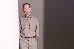
Studio photographers have always been able to give themselves the option of a plain background, but us location chaps have to take what we can get and the story of this picture will, I hope, illustrate the thought process behind giving the layout team as many options as possible.
The guy in this picture is the head of a large computer science faculty in one of the UK’s most prestigious universities. The job brief mentioned that they might like to run either a headline or some copy over the image, but equally that they might not. That translates into shooting as much as possible to give them as many options as is humanly possible in the half hour slot that I had to shoot the picture in.
My first move was to take him into one of the large computer labs where banks of PCs and striplights would provide some interesting opportunities for a creative portrait. The complicated backgrounds that this kind of location provides do not allow too many chances for running copy, so we moved to a second location – a modern corridor – to shoot the simpler images. The lighting was suitably dim and the walls and doorways were a dull shade of light grey and the pillars were white. Areas of flat colour don’t always have to be behind the subject, they can just as easily be a flat wall in the foreground as this picture shows. He has a wall behind him, a pillar beside him and another wall between him and me. The careful use of composition and lighting allows the photographer to make use of any, or all, of these.
I decided that my customary single Lumedyne was perfect for the job and positioned my subject so that he was lit from 45 degrees to his left and this also meant that the pillar to his right was well lit. The flash unit, with a 90cm (36″) white umbrella was positioned behind the wall in the foreground with the centre of the lightsouce just above the subject’s eye level, allowing the foreground to go very dark. The background goes darker by about two stops, giving the graphical striped effect to the image. The small amount of ambient light was all but eliminated from the overall exposure by shooting at 1/250th of a second and the subject was flash metered at f5.6 on 200 ISO. An even white to the left of the page and an even dark grey to the right of the page allowed the design team to drop a white “reversed out”.
Just about everywhere you there are opportunities like this, and the hardest thing is often to persuade the subject to come out of their carefully tidied office and stand in an anonymous corridor elsewhere in the building. It’s all about being confident about what you want to achieve and communicating that kind of confidence to your subject. People pick up on signals and as a photographer you need to be clear what signals you want to give out, and be convincing about giving them out.
Being a staff photographer obviously allows me to have more detailed discussions with designers and means that I have a deeper knowledge of the “house style”, but as a freelance you will always be appreciated by the client if you have consideration for the way they work and if you give them more choices when it comes to laying the pages out. The days of images fitting into predetermined boxes have gone.